Prediction: Nav bars will go away
Not only are nav bars becoming increasingly bland, but they're already an ergonomic problem that will be exacerbated with a larger iPhone
May 21, 2014
In the seven years of iOS, navigation bars have been a staple of non-game app design. There are a few reasons to believe that in the next few years they'll become obsolescent, much like persistent tabbed menus (Facebook's vintage tabbed menu and Instagram's still-modern menu notwithstanding).
Firstly, nav bars bars have grown boring. The popularity of flat colors and buttonless text labels in iOS 7 has diluted the personality of so many apps, and it's hit those apps nav bars especially hard. Jared Sinclair hits it right on the head:
There is almost nothing you can do with a navigation bar anymore. White, blue, or – if you're lucky – your brand's primary color.
— Jared Sinclair (@jaredsinclair) May 21, 2014I had a similar thought the first moment I opened Swarm, which oddly uses an image of the view yet to be filled in as content as its splash screen.

It's exactly what you've come to expect in iOS 7: A flat color devoid of branding or any kind of distinction. And once the main view fills in with content, it's only distinguished by a single color and the unique (but eminently trendy) shape of the avatars.

No one's pining for a return to the days when apps looked like this, but give this old screenshot of Foursquare some credit: The feel and the branding of this view is unmistakably Foursquare.

iOS 7 is mostly responsible for making nav bars as boring as they've become, but the problem probably dates back to when apps dialed back the use of logos in the nav bar. Evoking the feeling of a brand in the absence of a logo is very difficult; in fact it's a trademark of great design and branding. Take a look at Marc Hemeon's button test — can you name the website the empty button belongs to? — or Jared Sinclair's app review of Glassboard, in which he calls out the app's lack of personality. So many apps today lack a personality as unmistakeable and vibrant as Threes.
The nav bar used to be a great opportunity to convey your brand; now, more often than not, nav bars in apps are just utilitarian. Much as bottom tabbed menus have diminished in popularity because they're merely utilitarian and take up space, I think top nav bars will become less and less common.
Speaking of space, here's the second reason nav bars will go away: It's physically uncomfortable to have to reach the nav bar with your thumb. I have average-sized hands, but in order to tap the nav bar with my thumb, I have to push the phone toward my hand with my other four fingers. It's not painful, but it's certainly not comfortable.
Scott Hurff summarizes the problem perfectly in his review of The Thumb Zone:
Coined by Steven Hoober, author of the O'Reilly book Designing Mobile Interfaces, the Thumb Zone is "the most comfortable area for touch with one-handed use." And while there are many variables at play here, he found that 49% of users held their phone in one hand and used their phone with one thumb.
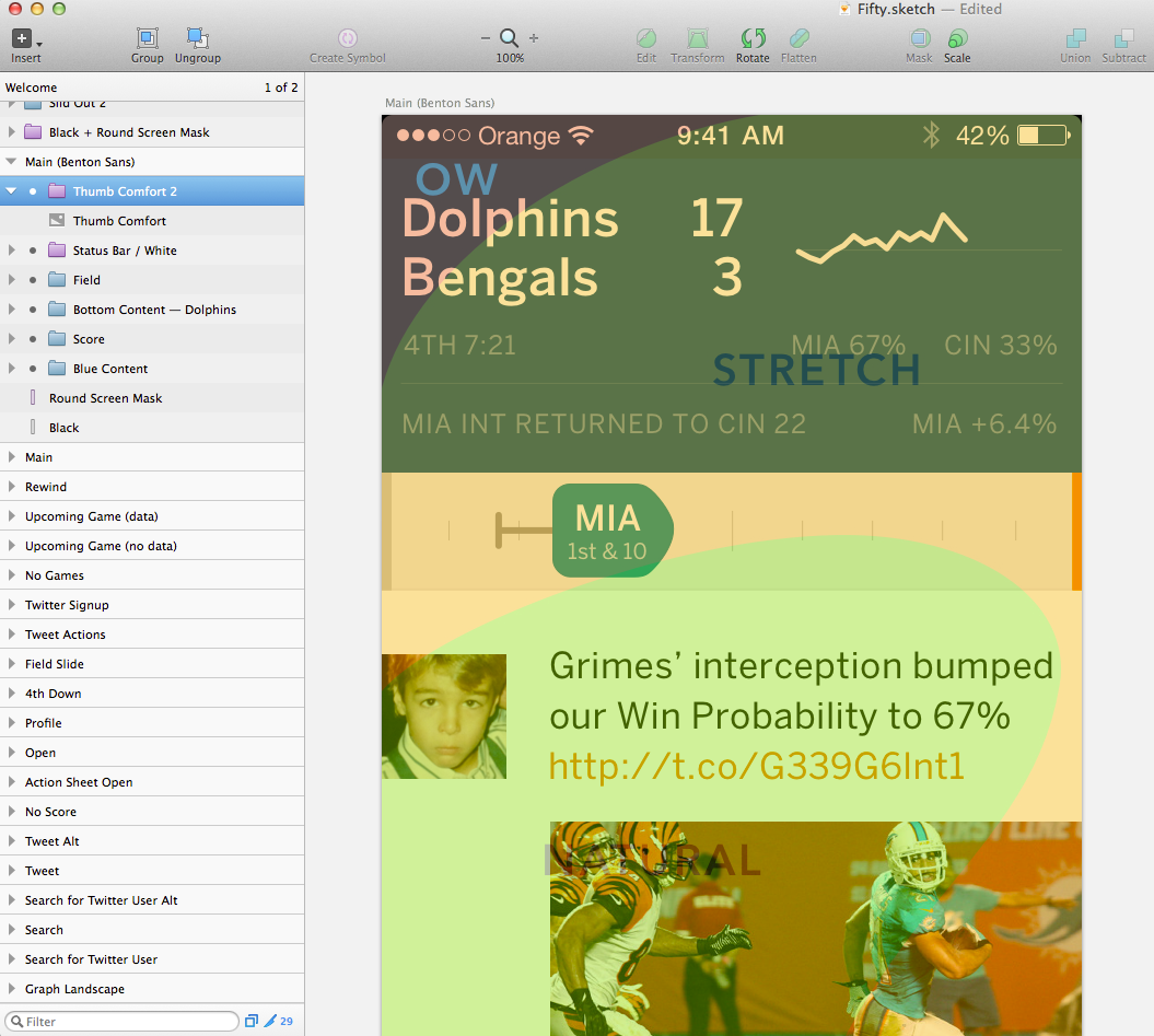
Enter Scott's Thumb Zone diagram, which illustrates what's comfortable to swipe with one's thumb.

I'm working on a new app, and I've got Scott's template as the top layer of every artboard in my Sketch file. When I'm done with a view, I toggle on the Thumb Zone diagram to check what's going to be comfortable for users. I aim to make the most important actions "natural" to tap on or swipe with one's thumb, and I stash the less common actions in a place where you won't mind stretching your thumb to every now and then. I prioritize things this way even if the view might look better otherwise.
I've eliminated the nav bar from my app because the nav bar performs so poorly in the Thumb Zone. Take a look at how the nav bar in a stock iOS 7 app, the new WWDC app, stacks up in the Thumb Zone:
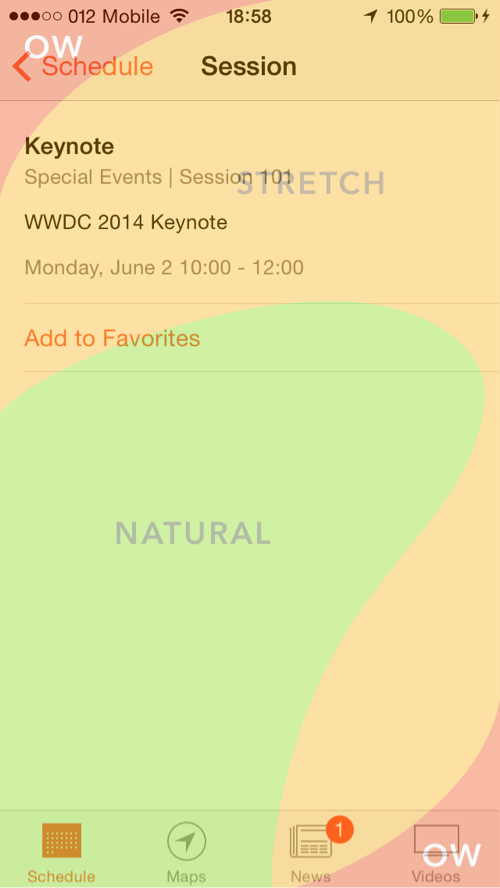
Simply put, it's a real pain to have to reach all the way to the upper left corner to press Back, and it's a stretch to tap whatever's in the upper right corner. Now of course in the WWDC app, as in many others, you can swipe from the left edge to get back to the previous view, but that's not an argument for keeping the top nav bar; it's just evidence that we're moving in a direction in which nav bars are superfluous.
And speaking of moving in directions, here's the third reason: smartphones are moving in the direction of larger screens. Everyone expects Apple to introduce a 4.7" iPhone and maybe even a 5.5" iPhone later at WWDC in June.
If reaching to the nav bar on a 4" iPhone 5 causes some discomfort, it'll seem downright silly on a larger device. Just try reaching for the nav bar on a newer Galaxy model or even the Nexus 5 — most people will need to switch the phone to their other hand and tap with their newly freed pointer finger on their dominant hand. That's a pain in the butt (where "butt" is a metaphor for your over-exerted finger).
My prediction about the demise of the nav bar could be wrong, but I have a hunch that if the nav bar sticks around as a convention on iOS, its primary function will be as a mere visual guide to what you can swipe to from the screen's edge. Nav bars might even shrink in height to make room for content, because it's so unlikely that you'll tap.
The bottom line: I think that nav bar tap has been tapped.
Update
A few readers asked me exactly what I had in mind as a replacement for the current nav bar. See below for a mockup of how it would look on the (navigation-starved) Medium app.
