Make art, not gloss
The Great UI Flattening is complete, and the way forward is art
One of the things I’ve long disliked about Google Material Design is that it appears to be an end in itself, a way to normalize, and, in my opinion, emasculate, web and app design. I believe the design language introduced in iOS 7, what with all its terrible flaws, was intended not as an end but as a reset. I’d like to think that, with new screen sizes, a watch, and an Apple TV SDK on the horizon, the principles introduced in iOS 7 were intended to carry us through this transition period, toward a day where rich and inventive design could thrive again.
Enough with the sameness: Big hero images with white cutout text, thin typography, an overabundance of circles and simple geometric shapes, background blur, and lots of negative space. In short, modest variations on the template that Medium perfected.
It’s as if we’ve all agreed to build interactive glossy magazines liked Medium instead of great user interfaces. The result is “Where have I seen this before?” designs like Vurb.
The Vurb app
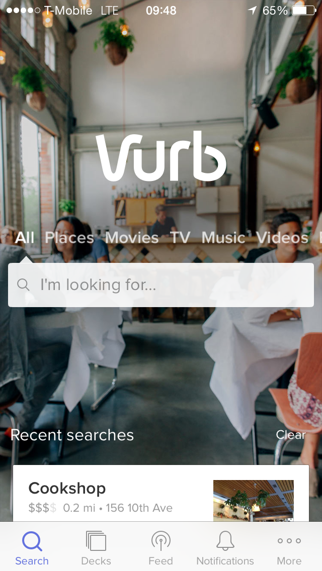
I admit, it’s very nice looking. (In fact, of the three people who I showed the following mockups to, all agree that the Vurb had made the right choices. And that’s true: I’m actually critiquing this era of design, not Vurb itself.) It seems far less than ideal to have to read semi-transparent text over a noisy background image. I also find it dull that every time you launch the app, the background image never changes. I’d much prefer that Vurb just keep it simple by removing that background image:
The Vurb app, de-glossed
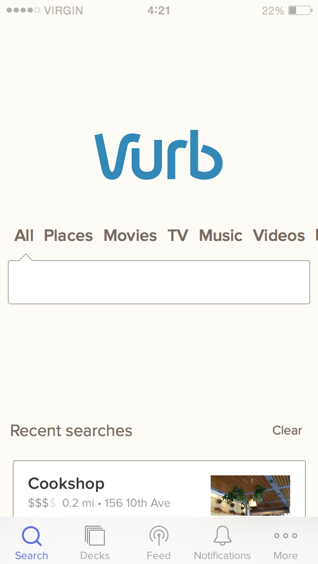
What I really want, though, is what I think would lift us out of the current state of homogeneity. Instead of that blasé photograph in the background, the app could wow me with beautiful, original artwork that I can’t get anywhere else and doesn’t compromise usability at all.
The Vurb app, embellished with beautiful art
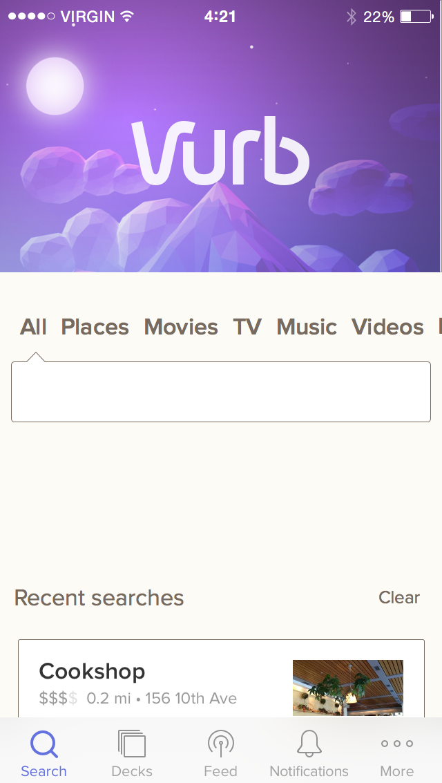
But boy would I rather look at that beautiful artwork, or some ever evolving version of it, than I would a stock photograph every time I open an app. I’d love for us to set a new bar in UI design that encourages graphic designers to do what posers like me cannot: design graphics.
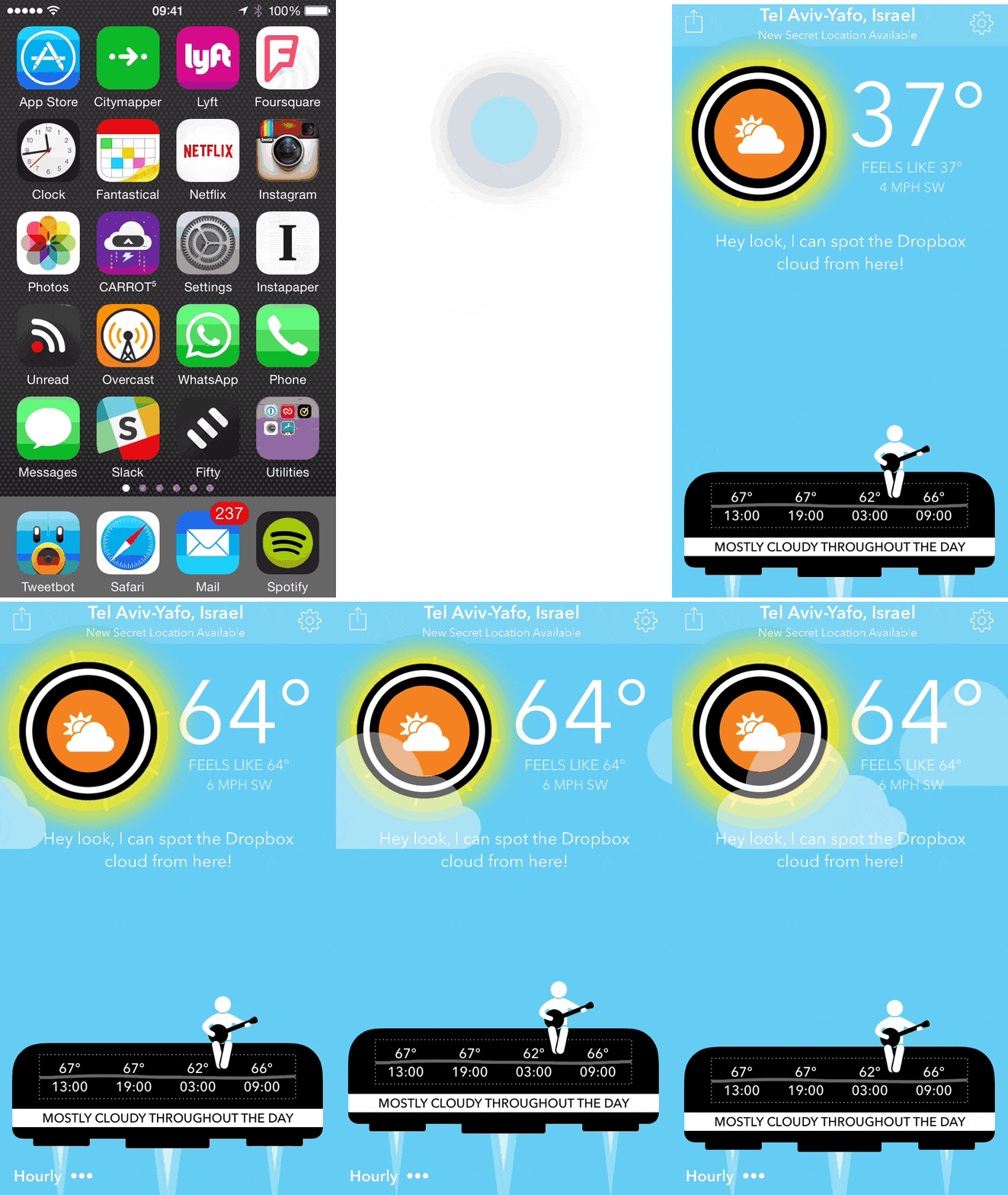
One app that has recently raised the bar is Carrot Weather:
Carrot Weather
¯\_(ツ)_/¯